Thursday, October 27, 2011
Design Education
Lines in this composition possess huge vitality. They seemed restlessly, randomly and endlessly dancing throughout all sides of borders. The curvy lines expressing the meaning of celebration and happiness play a key role to express the concept of this design. The runny linear feature of the lines generates an atmosphere of freedom and celebration.
Each unique Shape in a design presents its own feature relating to a lot of meaning. In this design, the negative space was divided into four triangles by two obvious lines comprised with typefaces. These four triangles create the sense of dynamic, tension and stress that related to the geometric structure of a contemporary design.
Color is the most essential component in visual communication. It is linked to plenty of meaning connected to our culture, and perceptive experience. In this design, green almost occupies two third of the space in the layout because it aids to express the concept which is the environment. Green delivers a feeling of pleasant to viewers because green come from viewer’s perceptive experience related to tree, grass and other elements of natural environment.
Sources of images:
http://backgrounds-for-computer.blogspot.com/2009/01/backgrounds-graphics.html
http://www.designjuices.co.uk/2010/06/graphic-design-inspiration-typography-text-art/
http://www.canstockphoto.com/preventive-environmental-protection-4391969.html
Thursday, October 20, 2011
Blog Exercise: Visual Thinking Research
|
Thursday, October 13, 2011
Week 7 Blog Exercise_feature hierarchy
This image was a poster connected to my major, Visual Communication Design. It was an Art Deco Poster. This poster is composed of shape channel and color channel. These channels work together to create a feature hierarchy, which also display the depth of the composition. The shape of the bird is detectable preattentively. The color feature channel over the shape feature channel of the bird makes the glass of wine more pop out. At the beginning, the viewer’s eye will detect the shape feature channel of the bird and the title because of their dominant size. However, the pop out of the color channel make the wine become the foreground contrasting to the background shape of the bird is more attractive to eyes of viewers. Color feature channel attract eye more effectively.
Photo from:
http://donovanolson.files.wordpress.com/2010/11/art-deco.jpg
Photo from:
http://donovanolson.files.wordpress.com/2010/11/art-deco.jpg
Thursday, October 6, 2011
Visual Perception 1 / Top-Down Visual Processing
The “Top Down” process is applied to the design of this poster. The purpose of the design is trying to motivate audiences’ attention to understand the concept of global environmental protection. The attention on the composition is a dominant image with a symbolize “person” riding a bicycle which two wheels are illustrations of the global. The” Top Down” attention produces bias and causes audiences favours on the central image while ignoring another less important information. In addition, the feature and pattern level creates an area of interest leaded to more fixations on this area.
http://www.cmu.edu/news/archive/2008/August/aug15_posters.shtml
Thursday, September 29, 2011
Week 5 Blog Exercise
Successul Example
This was a successful poster design “The National Ballet of Canada”. The asymmetrical balance of the composition created a motion impact which appealing the eyes of viewers. The vertical aligning typeface on the left side of the layout cooperating with image of a ballet dancer composted of an elegant form, which created asymmetrical balance and sharpened the design.
Fail Example
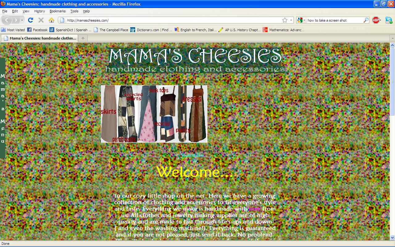
This was fail design web page where viewers would be confused by the random and imbalanced placement of design elements. The title of the website, the photo of product and text were placing without syntactical guideline. Those components together produced an uneven edge on the centre of the web page. The menu bar was placed vertically on the far left side of the page causing losing connection with other content of the website. Consequently, the design of this web page was fail to deliver message to their targeted audience.
Thursday, September 22, 2011
Blog Exercise: Visual vs Symbolic Language
Representational content: Unhappy person, Stock board (not obvious), urban landscape; Symbols: Text (horizontal); Underlying compositional structure: arrow-pointing upward, Red, white, text scale.
The photo displays a man sitting in front of the stock board with his back turning to viewers and his hand holding his head (seemed covering his eyes). The man seems unhappy. The scene of the man, the background of the Stock bard and the urban landscape are associated with economic issue, which resulted in the sadness of the man. When viewers move their eyes from left to right, they see the white text “UNEMPLOYMENT RATE” and the red arrow pointing upward to the text “RATE” which size is larger than other text. These elements added together emphasize the size of the “RATE” is large. The red on the arrow implicates alert and its upward direction helps guiding viewers eyes to the white text “UMEMPLOMENT RATE”. In addition, the red arrow pointing upward suggests unemployment rate rising. The English text can be replace with another text of language such as Chinese.
Wednesday, September 14, 2011
meaning 2: Interactions Between the 3 levels
The poster for “Earth Day” demonstrates three levels of visual including representation, abstraction, and symbolism.
The representational level is a picture of a tree leave spanning through the two dimension of the poster. The tree leave represents the environment that we have been living. It appeals viewers to pay attention to environmental issues.
Related to other two levels, the representational level of the design serves to deliver to message of the basic concept that is the environmental issue.
The abstractive level is an illustration abstracting from a representational human face for expression. The representational human face was distilled into a drawing of a contour of a human face and two eyes. The eyes cause impact to viewers and appeal for the concern of the environmental issues. This level helps to develop the basic concept expressed by the representational level.
The symbol level displays some text information and a symbol of the earth abstracted from the representational globe. The symbol delivers a message to viewers that express the issues about earth. Associating with other levels, the symbol level is help to convey a message that is calling on peoples worldwide to take responsibility to environmental protection. In general, three levels of visual tie together to construct the whole design.
The representational level is a picture of a tree leave spanning through the two dimension of the poster. The tree leave represents the environment that we have been living. It appeals viewers to pay attention to environmental issues.
Related to other two levels, the representational level of the design serves to deliver to message of the basic concept that is the environmental issue.
The abstractive level is an illustration abstracting from a representational human face for expression. The representational human face was distilled into a drawing of a contour of a human face and two eyes. The eyes cause impact to viewers and appeal for the concern of the environmental issues. This level helps to develop the basic concept expressed by the representational level.
The symbol level displays some text information and a symbol of the earth abstracted from the representational globe. The symbol delivers a message to viewers that express the issues about earth. Associating with other levels, the symbol level is help to convey a message that is calling on peoples worldwide to take responsibility to environmental protection. In general, three levels of visual tie together to construct the whole design.
Subscribe to:
Posts (Atom)